Worlds Apart: Exclusion-processes in DDS.
Els Rommes
Twente UniversityAbstract.
More and more interfaces are designed for ‘everybody’, instead of with a specific user-group in mind. In practice, most of them are still used by the ‘typical Internet-user’, the highly educated, white young male with extensive computer and Internet-experience. Amsterdam-based digital city DDS is no exception to this rule. In this article, the interface of DDS is studied with the help of ten first-time users with a more diverse background. Did they face any barriers in using DDS? And what kind of work did they need to perform to use the interface? This study shows that the most serious problems the first-time users faced were not caused by a lack of skill, but by the different technological frame they had. Thus, a script-analysis with the help of ‘outsiders’ seems to be an effective way to uncover some exclusion-processes of a digital city.Introduction
In October 1996, a new user-interface was introduced in the well-known, Amsterdam-based Digital City DDS. This interface was the third to be introduced, and it incorporated the latest features of the WWW. The design-team had very idealistic and convincing arguments for the design-choices they made. They wanted to make DDS original, dynamic, innovative, and commercially viable . Perhaps most of all, they wanted to make a design that was user-friendly, so that ‘everybody’, ‘even my granny’ as one of the designers stated, could use it. But, as with most digital cities, hardly any ‘grannies’ use DDS. Although the user-population of DDS has become slightly more diverse, it is still a very biased group, mostly consisting of young, highly educated, white males . Could it be that the interface of DDS poses barriers for users with a more diverse background?
For my analysis of the potential barriers in the interface of DDS, I use the concept of ‘script’. Akrich defines the script of technical objects as follows: ‘technical objects define a framework of action together with the actors and the space in which they are supposed to act’. This script is, often unconsciously, made in the design-process by the designers who construct images of the users and use-situations . If the images the designers make do not fit with the use-situation of potential users, the resulting script can work excluding. Orlikowski gives some insight into when such a script works particularly excluding. She (p.180) shows how designers often have different expectations, assumptions and knowledge about some key aspects of ICT, than users have. She calls these expectations, assumptions and knowledge about ICT the ‘technological frame’. Designers and users tend to have a different technological frame ‘by dint of their membership in particular social groups and the different roles and relationships they have with technology’ (p. 179). As this frame gets inscribed in the technology, it can be expected that the script of a technology will exclude the members of the groups which differ most from the social group to which designers belong. Following this line of reasoning, it would make sense that the script of the Internet in general and of DDS more specifically tends to have an excluding effect on people with a lower education, unemployed people, inexperienced computer-users, women, ethnic minorities and elderly people.
The terms I use, such as ‘exclusion’ and ‘barriers’, seem to suggest that users are static entities who are influenced by the script in a particular way. This suggests a technological determinist view on the script of technology. Of course, people in society and technologies constantly change, mutually influencing each other. The level of education may rise or drop amongst different groups in society, images of technology in society evolve, barriers may vanish while new barriers appear and groups of people who were formerly excluded get included while others are excluded again. So the script-analysis I want to perform is an analysis of the ‘mechanisms of adjustment’ or the failure to adjust between a technology and a potential user. In other words, it is about whom has to perform what kind of work in order to be able to use a certain technology in present society. With ‘work’ I not only mean the time and effort spent by the users to learn how to use the interface, but also frustrations, self-doubts and even anger users feel during the process. As DDS is meant to be used for pleasure and users are in no way obliged to use it, this work can form an important barrier for their continuation of the use of DDS.
I start with describing the method I used. Then I describe the interface I studied and some of the backgrounds of the design-choices. Consequently, I study the problems first-time users faced as they tried to deal with the interface. I focus on the problems they had with the metaphor and with the learning-process. Finally, I will discuss whether and to whom the script of DDS has posed barriers for using it and I discuss the effectiveness of the method I used in bringing these to light.
Methods
What makes a script-analysis complicated is that designers make many of their design-choices unconsciously as they are based on their technological frame. A frame which I, for a large part, share. Asking the designers what kind of assumptions they build into the technology, or even analyzing the script myself, will not bring to light every part of the script that may exclude potential users. And, according to Akrich , to ‘study of the ordinary user is not very useful because he or she has already taken on board the prescriptions implied in interaction with the machine.’ So analyzing the script with users, who have already integrated the script, is not helpful as both the script and the mechanisms of adjustment have become invisible. To ‘de-script’ DDS, to decipher the technology back to words, I will use the perspective of ‘outsiders’, which is a well-known technique in both feminist studies and anthropology.
Because this is an explorative study, qualitative analysis is used to get more insight into the particular mechanisms of adjustment and the potential reasons for its failure. I have chosen a case-study approach, in which I went back and forth between analyzing the design-process and the information I got from ‘outsiders’ experiences with the interface. I got my information about the design-process of DDS 3.0 by interviewing key-informants, reading the archives and analyzing the resulting interface. For this article, I have tried to find some of the technological frames of the designers which led to the design-choices with which the outsiders I chose seemed to have the biggest problems. Quantitative data give some insight into which groups of users are included or excluded by a technology at a certain point in time, in other words, for which groups the processes of adjustment does or does not take too much work. Thus, references to quantitative research will be used to give a first impression about the generalisability of the findings in this study.
Selection of the ‘outsiders’
I wanted to select people who had no previous experience with DDS, because first-time user experiences make particularly visible what kind of technological frames people use as they try to make sense of a new interface . A second criterion I used is a common criterion in usability testing practices. According to several usability experts, it is good practice to study interfaces with the ‘least competent user’ and ‘not just those who happen to have the same characteristics as the developers themselves’ . These kind of ‘first-time’ or ‘novice users’ offer ‘excellent indicators of a product's overall usability and ease of learning’ (ibid). Certainly, these kind of users are outsiders in the sense that they are rarely taken in consideration in present design-practices . Moreover, their skills in handling computers and the Internet are very different than those of the designers, as is their confidence in handling these technologies and their expected enthusiasm for it.
Because I was not so interested in observing the very basic struggles of these first-time users with the mouse and Windows, I found nine of my ten first-time users in a free course to learn the basics of computers and the Internet, organized by the municipality of Amsterdam. Thus, most of them were interested in computers and the Internet. The tenth first-time user, 60 year old Truus who had been a lab-assistant, was not interested in following the course as she was not interested in computers. I included her to get some impression about the difference the attitude towards computers and the Internet could make. The first-time users had different levels of experience with computers and the Internet. For five of the participants, the course was their first ‘hands-on’ experience with computers and the Internet, though most of them had observed a family-member or friend while they used the Internet. I took care to study them half-way the course, after they had had an introduction to the computer and Windows, but before they were introduced to the Internet, so that their interpretation of DDS would not be influenced by their impression of other parts of the Internet. Two of the participants to this ‘course in basic skills’ had extensive experience with the Internet: Judith had used the Internet for two months on a daily basis and Jan had spend the last year surfing the Internet for up to eight hours a day. This shows the diversity in opinions about what basic computer-skills precisely are.
Because I am interested in issues of diversity, I took care that the participants in this study had a diverse background. I wanted the first-time users I selected to have a different social-cultural background than the designers, as I expect this to have influence on their technological frame. So when I asked participants of the course to participate in my research, I tried to diversify them on the basis of gender, age and cultural background. This was the third and last criterion I used in selecting my first-time users. Six of my first-time users were female and their ages ranged between 44 and 70 and three originated from another country than the Netherlands. They were also different in their family-situation and their educational and professional background. Only two of them had a job. The professional background of the first-time users was very diverse.
I held semi-structured interviews with the first-time users in which I focussed on what they thought of computers and the Internet, what they found attractive and unattractive about it and what they would want or expect of a ‘digital city’, in other words, about their technological frame. Moreover, I observed each of them as they tried to make sense of the interface of DDS, to find out how their frames of reference influenced their use of DDS. I used the ‘thinking aloud’ method as I asked them to formulate the thoughts they had as they tried to use the interface. During their attempts, I noted which parts of the interface attracted them, which parts they (dis)liked and which parts were (un)clear to them. According to Nielsen , in this method ‘the test users enable us to understand how they view the computer system’. As I want to get more insight into the technological frame of the first time users, this method seems to be particularly useful. Because I did not have access to an official testing environment and because I wanted them to feel comfortable, I performed the interface-part of the research in the classroom in which they were given their course.
As with all methodological choices, the choice of these methods has some drawbacks. The presence of a researcher may cause the first-time users to show interest in other parts of the interface than they would have had if they had been exploring the interface by themselves. And, as I asked them to use the interface, it is also less clear when they would have stopped had they been alone. By asking them to use DDS from the start-page, how and if they would ‘find’ DDS themselves is invisible, or even if they would enter DDS by using the start-page. Finally, the presence of a researcher may have helped them overcome some of their fear to ‘just press buttons’, as they knew the researcher would act if something went wrong.
The design-choices in DDS 3.0
The successful integration of a new artifact in society can be said to mean that it is fitted into the prevailing cultural frames. One way to make this ‘fit’ easier is to use a metaphor, which links the new artifact to a familiar image [Nielsen, 1993 #38: 126, 127; Oost 2000: 11]. This is what the designers of DDS did in 1993. To make the integration of the then new Internet-technology in society easier, they used the city as a metaphor for the virtual space and community they created. They tried to avoid unfamiliar technical terms by using metaphors related to the city, such as squares, houses and a post-office. They did not want it to relate too much to the physical city Amsterdam (Interview Stikker, founder of DDS: 2, 3). In other words, they wanted to use the metaphor in a ‘not grounded’ way.
Because the founding organizations of DDS were Amsterdam-based and the city council of Amsterdam sponsored DDS, the city-metaphor was also used in a ‘grounded’ way. The ‘grounded’ use of the city-metaphor on web-sites means that they ‘relate coherently to the development of specific cities (…) and concentrate on integrating Web content located within the physical space of one city’ (Graham and Aurigi 1997: 36, as cited in ). DDS related in several ways to the city of Amsterdam. The logo of DDS is reminiscent of the coat of arms of Amsterdam, the names of several squares in DDS are based on districts in Amsterdam and DDS represents a lot of information about Amsterdam. Because the original founders of DDS either worked for political-cultural non-profit organizations in Amsterdam or had close ties with them, the information represented in DDS is mostly provided by these kinds of organizations. This shows how the technological frame of the designers influenced their interpretation of the city-metaphor.
For commercial reasons, gradually DDS came to represent less information about Amsterdam. The management of DDS needed the money organizations would bring in, so they were not selective in allowing non-Amsterdam based organizations to represent their information inside DDS. About two thirds of the information inside DDS is not locally based anymore . The commercialization of DDS did, however, not lead to considerably more information from shops, banks, restaurants or other companies which can be found in a real life city.
During the design of DDS 3.0, the designers never questioned the use of the metaphor ‘city’ and the way the original designers had envisioned its use. So although DDS contained not nearly as much information about Amsterdam as when it was founded, the designers of the new interface DDS 3.0 maintained the references to Amsterdam in their design. At the same time they wanted to use ‘city’ only metaphorically. So they designed a very abstract, two-dimensional graphical interface, in which only the language reminded of a ‘real’ city. All in all, the use of the metaphor ‘city’ in DDS 3.0 remained an ambivalent combination of grounded and not grounded.
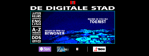
How did the designers use the metaphor of city? At the home-page, the most visible use of the metaphor is that the potential user who wants to enter DDS has to decide whether to ‘pay a visit to the city’ (access the interface) as an ‘inhabitant’ or as a ‘tourist’ (see figure I: ‘bezoek de stad als bewoner’ or ‘toerist’). ‘Inhabitants’ of DDS are users who have filled out an on-line form in DDS with their name, address and phone-number. Inhabitants of DDS get an e-mail account (accessible via the ‘post-office’), they can ‘build a house’ (design a homepage) and they can participate in the ‘café’s’ or other interactive environments of DDS. These kinds of facilities are denied to ‘tourists’, users who have not subscribed to DDS, because the designers of DDS want to have ‘some control about the content in DDS’ (interview help-desk participant). Entering the city as a tourist will take the user to the ‘central square’, an octagon which is connected to several other such ‘squares’, each with their own theme. In the following figure, the main part of the home-page of DDS 3.0 is shown.
Fig. 1. The home-page of DDS 3.0
The icon on top of the interface is very similar to the coat of arms of the city of Amsterdam. Users suggested an index as a navigational method after the initial introduction of DDS 3.0. The button ‘A-Z index’ in the menu on the left side of the screen, was made to accommodate them and contains an alphabetical index of the information-providers in DDS. This index and the ‘map’, which is presented at the next pages of the interface, offer ways to navigate through DDS. The ‘map’ button links to a colorful honeycomb with in each octagon a symbol that represents the theme of the square inside DDS to which it links.
The advertisement-buttons at the bottom of figure I (‘sun, ‘uunet’, an outdated one and ‘tron’) were introduced for commercial reasons. The designers thought they would cause no problems, as they had asked inhabitants of DDS at a real life meeting what they thought of the introduction of banners in the city. According to the designers, none of the inhabitants had objections against advertisements.
Although help-texts were available in DDS, these were not introduced at the opening screen of DDS. These texts were made by help-desk participants, often volunteers. According to one of the designers:
‘There were by far not many texts enough, of course. And documenting is a profession. And of course here it was given no priority at all.’ (Interview designer DDS 3.0, van Eeden: 26)
The choice not to give many help-texts and to put them in one central place, was partly made because the designers liked to play around as a way of getting to know the system. The way the designers wanted users to learn how to use DDS was by ‘playing around’. This was the learning-methodology the founders of DDS had introduced from the start and which they personally found most attractive . So this was another reason why the designers did not write any explanatory texts in the interface.
By this description of the design-choices, it gets clear that the designers often used themselves (e.g. in their ambivalence regarding the use of the metaphor, in their choice of the organizations of which they represented information and in the choice for the ‘playing around’ methodology) or the inhabitants of DDS (in the case of the decision to use advertisements) as exemplary for the user they wanted to attract. In the next paragraph, I will discuss my interpretation of the consequences of these choices for my first-time users.
The first-time users understanding of DDS
The metaphor
What did my first-time users expect from something called ‘a digital city on the Internet’? This question seems hard to answer, especially because more than half of the participants had not heard of DDS before. Nevertheless, the name ‘Digital City’ evoked a lot of inspiration amongst the first-time users about what they expected or hoped they could find in such a thing. Their expectations were partly formed by their expectations of the Internet: ‘a lot of information and also communicating with people’. Partly their expectations were formed by the name ‘digital city’. The ‘digital’-part of the name presupposes that potential users have some idea about what digital means. Obviously, this is not the case with people without much experience with new technology. Indeed, three female first-time users either remarked that they did not know what it meant or compared it with for example ‘electrical cooking instead of on gas’ (interview Anna, p.5). The ‘city’ part of the name evoked more responses from the first-time users. It made them expect and want to find lists with shops for clothes and furniture (preferably with pictures and ways to compare the different shops), pubs, restaurants, information on public transportation, maps and information for people looking for a house. Most importantly, they expected and preferred all this information to be focussed on Amsterdam. Graphically, they expected to find pictures of buildings in a fysical city, some even hoped to find pictures of their own neighbourhood. Two participants hoped they would find pictures and information about what Amsterdam used to look like when they were young.
The designers of DDS had based their use of the metaphor on the city they knew, a public domain where citizens can discuss and non-profit political and cultural organizations give their information. This use of the metaphor contrasted with the reading of the metaphor by the first-time users. Whereas the designers understanding of the metaphor city was informed by their work, the technological frame of the first-time users was informed by their daily-life experiences with a ‘city’. These daily activities involved shopping, travelling by public transportation or going to a café. For them, ‘city’ meant Amsterdam, a geographical location where their homes, activities and their memories are situated. Moreover, a remark of sixty year old widow Truus made me realize that ‘city’ is not a neutral metaphor. She said she ‘does not do anything in the city since it has become so unsafe’ (p.3). This observation calls to mind that a city may not be such an attractive metaphor for women and elderly people.
The design of the interface of DDS did not offer any help to the first-time users in re-interpreting their understanding of the metaphor. On the contrary, it only reinforced their interpretation of DDS as a representation of their own everyday life city, by the use of metaphors such as tourist, inhabitant and the logo on top of the home-page. Even sixty six-year-old Stella, who was the only participant who did not expect to see anything from Amsterdam, (p.4) changed her mind as soon as she saw the home-page of DDS. From then on, she expected ‘information about public transportation or districts in Amsterdam’ (p.5) if she entered DDS.
The ambivalent grounded and not-grounded use of the metaphor by the designers caused a lot of confusion and frustration amongst my first-time users. The problems they had in dealing with the home-page offers a good example of this. All except Judith thought that ‘inhabitant’ meant ‘inhabitant of Amsterdam’. As they clicked on the text ‘enter the city as inhabitant’, a pop-up screen appeared, stating ‘user-name’ and ‘password’. They could not understand what they had to fill in. To some of the first-time users it was hard to understand why they, as citizens of Amsterdam, could not enter DDS as an inhabitant. Others thought it ‘fun’ to visit Amsterdam as a tourist, because they hoped to be shown ‘places you not normally encounter as an inhabitant of Amsterdam’, as experienced Internet-user Jan stated. The fact that they were not shown around parts of Amsterdam was felt as a disappointment.
One of the participants thought she could order a cab by using the button ‘zijwegen’ (‘side-streets’, which links to a page with related websites), which shows the graphical symbol of a cab and several others expected to get a list with café’s if they would press the ‘café’-button. The things that did show up when they pressed these buttons, were so different from what they expected that they could not make sense out of it. The confusion of some participants was particularly clear in the use of the ‘map’. Though the designers had made it as a navigational tool, all first-time users expected to be shown a map of Amsterdam. As 62-year-old seamstress Ine said:
‘This is a map of Amsterdam, shall I look at it? (She clicks on the button) No! I really can not see anything on this! (laughs) I do not like this at all, not at all! Cause if you click on a map of Amsterdam, naturally I want to see it! (….) You expect to see a map and then you see all those different colors mixed confusedly. No, that is very disappointing.’ (p. 9, 10)
As this quotation shows, for Ine this use of the metaphor was confusing and she did not like it. Although some of the other participants discovered they could click on parts of the map and use it as a navigational tool, all of them expressed similar feelings of frustration as they tried to make sense of it. For Ine, the framework of action of DDS was too far apart from her technological frame and required too many adjustments from her part, so she gave up.
The attempts of the first-time users to understand and use the metaphor of DDS show many more instances of the work they faced, such as clicking on the wrong links, adjusting their views on what DDS was about and handling the frustration, anger and confusion this caused. The script of DDS was not flexible, as it did not allow the first-time users interpretation of the metaphor. In this way, the framework of action of DDS excluded several potential users. Because even the two first-time users with a lot of experience with the Internet struggled with the metaphor, it can be assumed that this exclusion was not on the basis of experience with the Internet. This barrier seems to be based on the social-cultural background of potential users, which gave them a different technological frame to interpret the metaphor with than the designers had.
The learning-process
The confusion the use of the metaphor caused could have been less if the designers would have chosen to explain more to potential users. They did not do this because they wanted the users to learn how to use DDS by ‘playing around’. Moreover, they did not realize that people might misunderstand their use of the metaphor, as it was based on their own unconscious technological frame and this was the way the metaphor had been used like since the conception of DDS. Thus, they thought the use of the metaphor was self-explanatory and they wrote hardly any explanatory texts in DDS. Seeing the problems the first-time users had with the interpretation of the metaphor, DDS was all but self-explanatory to first-time users.
So what kind of work did the first-time users have to perform to learn how to use DDS? Experienced Internet-user and highly educated Judith spent a lot of time to look for clues on what DDS was about. She did this in the way the designers had envisioned: by pressing different buttons and ‘playing around’. She, however, expressed several times how frustrated she became because it took her so much time and still she could not get clear what DDS was about. The playing-around learning style was not attractive nor effective for her. Had she been surfing on her own, she told me, she would have given up very quickly, because ‘it was not easy enough for me to get inside’ (p.11). After almost an hour of trying, she still was unsure whether DDS was to search certain information or for social reasons. She had to perform too much work to get adjusted to the script, so she gave up.
Not only did DDS give no clues about what DDS was to be used for, inside DDS there were also not enough or not clear enough clues about how to navigate or what certain things would connect to. For the first-time users without previous Internet-experience, this was particularly problematic. Faced with the home-page of DDS, all of them were looking for a ‘start-button’, or a way to ‘enter’ DDS. Presumably because of their button-like character, the four advertisements at the bottom of the entrance-screen were most similar to what they were looking for. Especially the one with a cross, which means that it is an outdated connection, drew a lot of attention. Almost all first-time Internet-users pressed one of the advertisements to ‘start DDS’. They did not understand that these advertisements took them away from DDS, as they did not know yet what DDS would look like. Without the help of the researcher, they ‘got lost’ and would not have seen more of DDS than the home-page.
The index was the only navigational method that all first-time users recognized as a navigational tool and which they could actually use. The index was, however, made with the internal logic of DDS in mind: only names of customers can be found in this alphabetical list. Because the first time users of DDS were looking for words in the index like ‘nature’, ‘health’, ‘gardening’ or ‘areas within Amsterdam’ they could not find what they wanted by using the index. Some of them drew the (incorrect) conclusion from this attempt that this kind of information was not available in DDS and they gave up looking for it.
A similar kind of use of a ‘designers-logic’ came to light when the first-time users got confronted with error and failure-messages. This happened many times to the first-time users. These messages were most of the time standard-messages that did not help them to deal with the particular situation with which they had to deal. A striking example of this is the message users get as they press the text ‘enter the city as inhabitant’, which because of the confusions around the metaphor, many of the first-time users did. A system-message pops up, giving no more information than ‘username’ and ‘password’. Pressing ‘ok’ at the bottom of the screen without filling in a user-name brought up the same pop-up screen, much to the irritation of the first-time users who did this. Clicking the ‘cancel’-button brought out another screen, stating amongst other things: ‘oops, no access to this closed building’ and ‘the owner of this building thinks you should not be here’. When this happened to 48 year old teacher Aram, he said:
‘Right at the start, you click at something and bang, you are immediately told that you are actually somewhere where you are not allowed to be. That is somewhat discouraging. It is not very hospitable. (…) if you start with that it is not very pleasant’ (p.15)
To some of the first-time users, this and similar kinds of messages caused self-doubt and confusion, as they felt the text meant they had done something wrong and they could not figure out what that could be.
All in all, one can say that the learning methodology in DDS was not attractive to first-time users. In the hour which was used for the interface-experiments, none of the participants could learn what DDS was about, what information could be found in it and how they could navigate through the city. They were not given sufficient help by the system to get to understand the system. The ‘playing around’ way of learning might be a nice way of learning if the frame of reference of the user is close to that of the designer. If that is the case, it may be easier for the first-time user to predict what will happen if they click on a link.
It seems DDS has been made for a very specific group of people who have the time and who want to spend it on ‘playing around’. Several authors suggest that men in general have more spare time than women and are more interested in ‘playing around’ . Women mostly want to use the Internet if they consider it useful and they do not spend as much time on it . Thus, DDS seems to be more attractive for masculine than for feminine users. These data suggest that it was not coincidental that Jan and Ferdi were the only first-time users who considered re-visiting DDS after this research, both men who said they enjoyed the ‘playing around’ style of learning. For experienced Internet-user Judith, who expressed that she did not like to play around on the Internet because she ‘lost so much time with it’ (p.4), this part of the script worked excluding.
The experiences of the first-time users as they tried to learn how to use DDS suggested that it was somewhat easier to learn how to use DDS for experienced Internet-users. Experienced users could, for example, more easily distinguish advertisements from the DDS-interface and they did not spend so much time to look for the ‘start-button’. On the other hand, the designers’ choice to make users learn how to use DDS by ‘playing around’ was more connected to gender than to the amount of experience of the first-time users with the Internet. And although most first-time users said that given enough time, they could probably learn how to use DDS, it seems that DDS did not fit their tastes and preferences. Nor did DDS provide them with a motive to invest the work needed for this.
Conclusions
What were the barriers the first-time users of DDS faced? In my study, I found two major aspects in the framework of action of DDS which did not connect with the technological frame of the first-time users I studied. Firstly, the designers assumed that their users would understand the concept of a virtual world by using the metaphor of a digital city. The designers use of the metaphor ‘city’ did, however, not connect with the everyday-life experience and the ensuing interpretation of the metaphor by the first-time users I studied. Though the use of the metaphor had originally been a tool to make it easier to use DDS, to the first-time users it has become a barrier. The second major barrier in the script of DDS was that users were expected to learn how to use DDS by ‘playing around’. For most of the first-time users, this meant that the work they had to put into adjusting themselves to the script of DDS simply was too much. The frustration, self-doubt and anger they experienced while they got acquainted to the interface were not matched by the attraction DDS offered to them.
What kind of conclusions can be drawn from the methods I used? This and other studies show that testing an interface with the ‘least skilled users’ seems to be a good way of at least improving the usability of an interface . As these skills are related to and overlapping categories as Internet-experience, professional status and gender, age and ethnic background, this would mean that the interface would be easier to use for ‘all’ . However, this study also suggests that ‘basic computer skills’, such as using the mouse or knowing how to use a scroll-bar were not the most important factor in deciding whether a first-time user could use DDS. The difference in technological frame between the first-time users I studied and the designers of DDS, seems to offer a better explanation for the problems of the first-time users I studied. Thus, I would argue to test interfaces with first-time users with a different technological frame than the designers, e.g. on the basis of their ethnical background, their gender or their age.
All in all, a script-analysis with the use of first-time users seems to be a promising way to uncover some of the exclusion-processes at work at the Internet. If designers want to take seriously their wish to reach ‘everybody’, they need to perform a lot more work to bridge the gap between their world and the world of the diverse users they try to reach.
Bibliography